Abstract composition.
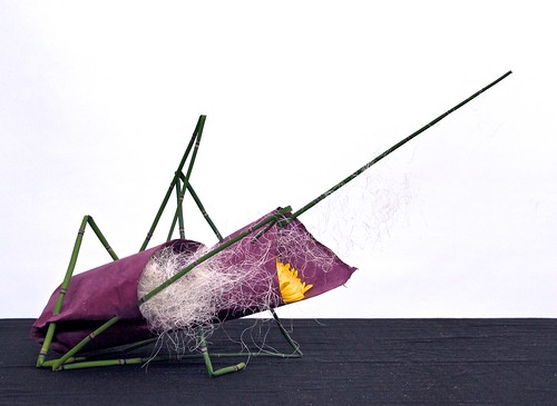
Equisetum, Japanese paper, Chrysanthemum, bleached sisal.
This arrangement is about creating an abstract composition with plant materials and paper. The idea is to use the shape and colour of the materials in a way that doesn't immediately make you think about this or that plant, but rather the sculptural quality of the arrangement.
There are many influences in contemporary ikebana from modern Western art. This arrangement has references to the abstract expressionist movement and the American painter Jackson Pollock.
The equisetum is the dominant material, followed by the paper and the Chrysanthemum. It's easy to see the basic ikebana principles of heaven, human and earth in this composition, if you translate the principles into the amount of materials used and the dominance of shapes and colours.
Blue Poles, painting by Jackson Pollock, 1952.
The colous sheme is Almost a split-complementary colour scheme with green, yellow and a purple that ideally could have been a bit more purple-red. In this case I found that a yellow and purple made a better contrast.
The colous sheme is Almost a split-complementary colour scheme with green, yellow and a purple that ideally could have been a bit more purple-red. In this case I found that a yellow and purple made a better contrast.

.jpg)


No comments:
Post a Comment