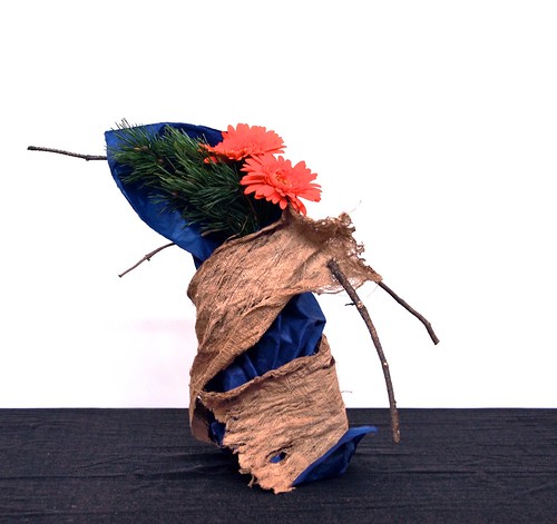
Colour study - red-orange, blue and green.
Japanese paper, Mulberry bark, Gerbera, pine.
I will continue to post arrangements from the workshop with Mit Ingelaere-Brandt that I attended last weekend. In arrangement number two the task of creating a form of paper and bark is combined with a colour exercise. I decided to use a split-complementary colour scheme for this arrangement. Mulberry tree bark and Gerbera forms a red-orange base, that is contrasted by blue Japanese paper and green pine branches. The split-complementary colour scheme has the same strong visual contrast as the complementary colour scheme, but has less tension. In addition to the base color, it uses the two colors adjacent to its complement.

Blue is a primary colour, while green is a secondary and red-orange a tertiary colour. The complementary colour of red-orange would be blue-green, so the split complementary colours (on each side of the complementary) are blue and green.


No comments:
Post a Comment